Although some aspects of markets never change, specific volatility and price patterns evolve over time, and only those traders who can adapt their strategies to the prevailing market conditions are likely to enjoy sustained success. “Dissecting T-note futures: Tendencies and characteristics” (Active Trader, July 2005) details the behavior of the 10-year T-note futures (TY) contract from March 1, 2004 to Feb. 28, 2005. This updated analysis reviews the 10-year T-note from July 3, 2006 to June 29, 2007 and highlights any changes in this market’s trading attributes. The characteristics the analysis covers include the market’s typical daily ranges, closeto-close moves, lows for up-closing sessions, and highs for down-closing sessions. These statistics help traders understand: How much the market moves during each trading session. Where the market tends to close within the day’s range. How much below the previous day’s close the market can be expected to trade and still close up on the day, which is useful information for traders holding long positions or those looking to go long on an intraday pullback. How much above the previous day’s close the market can be expected to trade and still close down on the day, which is useful information for traders holding short positions or those looking to go short on an intraday “pull up.”
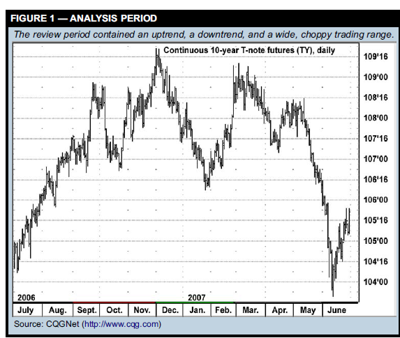
In addition, the Fridays when the employment report is released are analyzed as a group, because this report tends to trigger big moves in the treasury market. The tick size for the 10-year T-note contract is half a 32nd, which is referred to as a “plus” tick. For example, in the price 108-04+ the “04+” represents four-and-a-half 32nds. In the following charts, prices have been converted from 32nds to decimal format, which would make the 108-04+ price 108.140625. For more information on T-note pricing conventions, see “Treasury refresher.” Figure 1 is a daily bar chart of the review period. After the July-September 2006 uptrend, the market essentially entered a wide trading range for several months, making a new high in December and a multi-month low in January. The spring sell-off brought the market to its lowest level in a year.
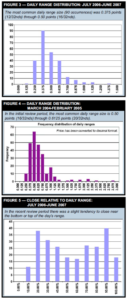
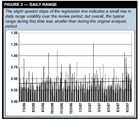
Daily ranges: How much does the market move in a day? The first market characteristic to be analyzed is daily range. Figure 2 shows the daily ranges from the July 3, 2006 to June 29, 2007 review period with a regression line plotted through the data. The regression line has a slight upward slope, indicating the daily ranges expanded as the review period progressed. The largest daily range was 1.265625 points (1-8.5/32nds), which occurred on Feb. 22, 2007. The smallest daily range was just 0.125 points (4/32nds), which occurred on Oct. 24, 2006. The average and median daily ranges of 0.4204 points (13.45/32nds) and 0.3750 points (12/32nds) were very similar, which suggests a 12 to 13/32nd range can be considered “typical.” By comparison, the average daily range from March 1, 2004 to Feb. 28, 2005 was 0.6044 points (19.34/32nds) and the median range was 0.516250 points (16.5/32nds). This is the first indication volatility has declined since the first analysis period — a drop of more than 30 percent in the average daily range (-28 percent in the median range). Figure 3 shows the frequency distribution of the daily ranges — how often daily ranges of different sizes occurred. Distribution analysis helps identify typical market behavior, as well as how often unusual situations occur. The x-axis, which represents range size, increases in 0.0625-point (2/32nd) increments, and the y-axis shows the number of ranges that occurred in the different size categories. For example, the peak reading (90, third bar from the left) means there were 90 days with ranges greater than 0.375 points (12/32nds) up to and including 0.50 points (16/32nds). Now look at Figure 4, which is the frequency distribution chart from the March 2004-February 2005 analysis window. Comparing Figures 3 and 4 highlights the daily volatility contraction that has occurred since the original analysis. In Figure 4, the peak reading (64 occurrences) of the daily range was between 16/32nds and 20/32nds — which means the upper end of the current most common daily range category was the lower end of the former most common category. There was a slight decline in this category in July 2006-June 2007: there were only 54 days with ranges between 16/32nds and 20/32nds. Another key trading tendency is how a market tends to close, which is the subject of the next portion of the analysis.
Treasury refresher Treasury bonds and notes are debt securities issued by the United States Treasury. They are considered debt instruments because by purchasing them you are loaning money to the Treasury department, which then pays you interest (determined by a “coupon rate”) on a semiannual basis and returns the principle when the bond or note matures on the maturity date. T-bonds and T-notes are called “fixed-income” securities because of the fixed coupon payment an investor receives while holding the bond or note. T-notes are issued in maturities of two, three, five, and 10 years; T-bonds have maturities greater than 10 years. The minimum bond or note size is $1,000. For example, if you purchased a $1,000 10-year T-note with a 4-percent coupon, you would receive $20 every six months, totaling $40 per year; the $1,000 would be paid back to you on the maturity date 10 years from now. A bond or note’s yield is its coupon payment divided by the price — in this case, $40/$1,000 = 4 percent. Treasury futures prices indicate a percentage of “par” price, which for any Treasury bond or note is 100. T-bond prices consist of the “handle” (e.g., 100) and 32nds of 100. For example, 98-14 is a price that translates to 98-14/32nds or $984.38 for a $1,000 T-bond. T-notes are priced in a similar fashion, except they can include one-half of a 32nd — for example, 98-14+ is 98-14.5/32nds, or 984.53 for a $1,000 T-note.
How does the market close?
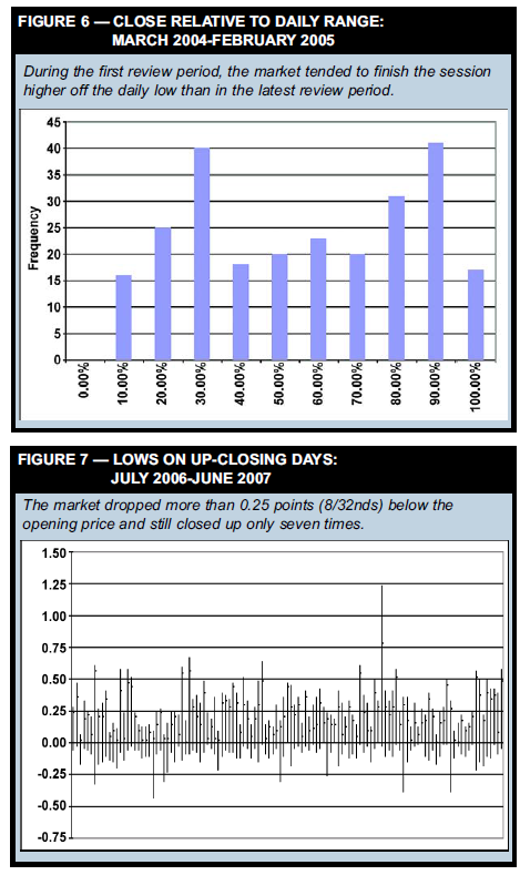
Figure 5 is a frequency distribution showing where the 10-year T-note futures tended to close within the day’s range on a percentage basis — i.e., a close at precisely 10 percent would mean the close was 10 percent above the low, a close at the 90-percent level would mean the close was 10 percent below the high, a close at 100 percent would mean the market closed at the high of the day, and so on. Each x-axis category in Figure 5 represents a range of 10 percentage points. For example, the “10%” bar represents the number of days (11) the market closed more than 10 percent up to and including 20 percent above the low. The two highest bars indicate the market often closed in the lower 20-30 percent of the daily range (the 20% bar) or the upper 10-20 percent of the day’s range (the 90% bar). Figure 6, which is the comparable chart for March 2004-February 2005, shows that during this period the 10-year T-note futures tended to close farther away from the low of the day than during the more recent period.
Up-closing and down-closing days
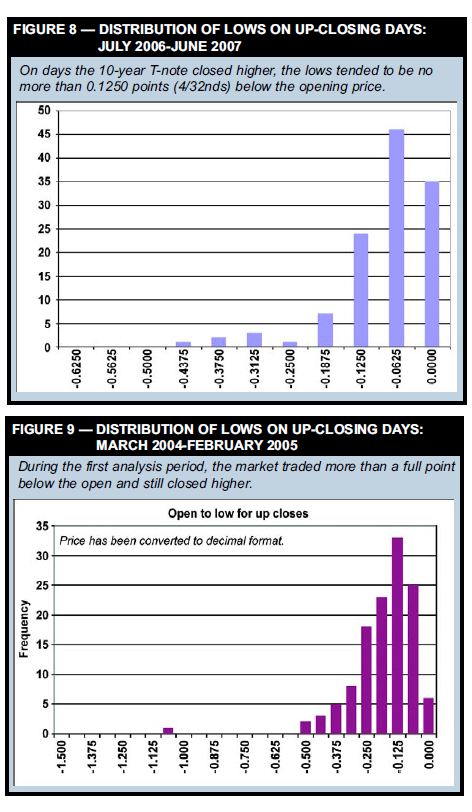
Another attribute to consider is how the 10-year T-note futures trade on up-closing days vs. down-closing days. Figure 7 plots the up-closing daily bars of the current review period relative to the session’s opening price. The bars are adjusted so that zero is the opening price, which makes it easy to see how much price action occurred above and below this price point. The market rarely traded more than 0.25 points (8/32) below the opening price on days it would eventually close higher — good information if, for example, you’re trading from the long side intraday and want to know how far you should let the market go against you before exiting. Figure 8 is a frequency distribution chart of the lows from Figure 7. Most of the time the market traded no more than 0.1250 below the open on up-closing days. The biggest postopening drop on an up-closing day was -0.4375 (12/32nds). Figure 9 is the frequency distribution for lows on up-closing days for the March 2004-February 2005 period. Comparing it to Figure 8 reveals there was a shift toward smaller post-opening down moves on up-closing days during the July 2006-June 2007 period, as well as a lack of extreme downside. Figure 9 shows that during the March 2004-February 2005 period the market was down more than a point and still closed up on the day.
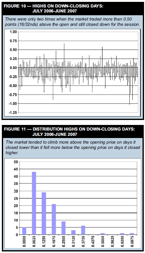
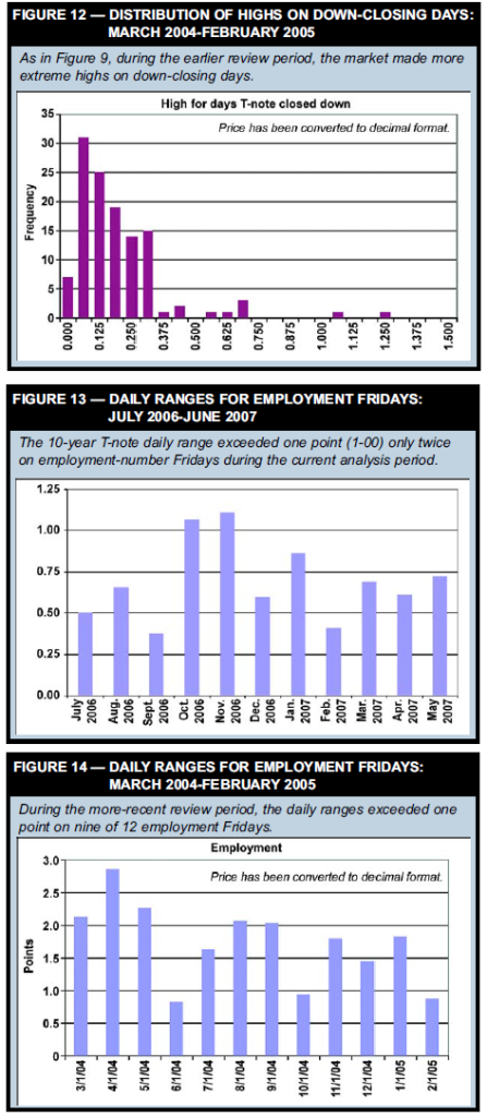
Figure 10 shows the daily bars for down-closing days adjusted to the opening price. The 10-year note tended to trade higher above the open on down-closing days than lower below the open on up-closing days. The market traded above the open by more than 0.25 points (8/32nds) and still closed down 13 times. Twice, the market was up more than 16/32nds above the open and still closed down. Figure 11 is a frequency distribution chart of the highs relative to the opening price for each session. Figure 12 is the comparable chart for the March 2004-February 2005 period. As was the case for lows on up-closing days, the market made more extreme highs and still closed down in the 2004-2005 period than in the 2006-2007 period. However, while volatility has dropped overall, in both review periods traders showed a tendency to bid prices higher above the open on down-closing sessions than to push it below the open on up-closing sessions.
Related reading “Dissecting T-note futures: Tendencies and characteristics” Active Trader, July 2005. A detailed understanding of a market’s price history and characteristics allows you to craft trade strategies founded on statistical reality rather than casual observation. The following analysis takes the pulse of the T-note futures market. Note: This article is also contained in the discounted compilation, “Thom Hartle Strategy and Analysis Collection, Vol. 2.” “Short-term T-bond trading” Active Trader, October 2002. This strategy takes quick intraday profits using rules determined by the daily trend. Using a combination of indicators, it is possible to trade Tbond futures on a short-term basis when the bond market is in a trend or trading range. This technique uses a multiple-time frame approach: Two indicators applied to daily bars work together to determine the trend; two others, Bollinger Bands and the moving average convergencedivergence (MACD) indicator, identify entry and exit signals on an intraday basis. “Treasury bonds and notes” Active Trader, June 2005. Trading Basics: A primer on the U.S. Treasury market. “The TUT spread: An active spread for active traders” Active Trader, October 2005. The spread between 10-year and two-year T-note contracts offers a vehicle for taking advantage of interest rate shifts. Note: This article is also contained in the discounted compilation, “Keith Schap: Futures Strategy collection, Vol. 1.” “The hidden factor in treasury futures pricing” Active Trader, March 2006. Those looking for insights into the treasury market should analyze the interesting relationships between the cash and futures market, as well as interest rate movements. “The 2-year/10-year Treasury spread and the S&P 500” Active Trader, September 2006. Traders often infer stock market behavior from developments in the 2-year/10-year T-note spread, but there might be less to this relationship than many think.
T-notes and the employment report
The first Friday of each month the Commerce Department releases the employment report, which can trigger wild moves in the T-note market, just as it can in the stock market. Figure 13 shows the daily ranges for each employment Friday between July 2006 and June 2007. The daily range exceeded a full point only twice during the updated review period. This is quite a change from the 2004-2005 period, during which the 10-year note daily range was more than a point on nine different employment Fridays (Figure 14).
Lessons learned
Some significant differences emerge when comparing the two analysis periods — all a function of the market’s reduced volatility. First, the average daily range dropped significantly — some 30 percent — between 2004- 2005 and 2006-2007. The 10-year note still exhibits a tendency to make lows nearer to the opening price on upclosing days than to make highs nearer to the open on down-closing days — but again, the extreme levels for both highs and lows have come down during the latest review period. Most striking is the decline in the typical daily ranges on employment Fridays. The market had a daily range in excess of a full point only twice during the new review period on an employment-report Friday. This type of research is critical for staying abreast of the market’s current condition and the kind of strategies that most likely work in it. Price targets and stop-loss levels built upon the statistics published in the 2005 article would be inappropriate for today’s T-note market.
Summer swoons, fall boons
Traders and investors often get nervous when the leaves start to turn, but summer sell-offs — such as the one that occurred this year — have usually not presaged fall meltdowns.
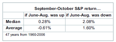
It was a rough summer for the stock market, but traders fearful of more carnage to come in the often-volatile months of September and October might take some solace from analysis of past years in which equities have slumped from June through August. As of Aug. 30, the S&P was down 4.7 percent from the May 31 close. In the 47 years from 1960 to 2006, the S&P 500 lost ground from the last day of May through the last day of August (close-to-close basis) 18 times. In 12 of those years, the S&P posted a positive return from the last trading day of August to the last trading day of October. The median September-October gain is 0.28 percent in years the S&P posted a June-August gain, but that figure jumps to 2.08 percent in years the index lost ground in June-August. Furthermore, of the six times the S&P failed to move higher in September and October, four (including 2001 and 2002) were years in which the S&P 500 was already down for the year as of June 1. In 2007, by comparison, the S&P was up nearly 8 percent at the beginning of June. Of the nine years when the S&P was positive for the year on June 1 but posted a negative June-August, seven had positive September-October returns. The number of examples will likely leave statisticians wanting more data, but these numbers bring a hypothesis to mind: In years the stock market is up significantly at the halfway mark, the absence of a summer decline may only postpone a correction until fall — and then make it more severe. A summer sell-off might flush out the market and reduce the potential selling pressure that troubles so many traders and investors in September and October. For more information on this study, and other stock-market sell-off trading patterns, see “Playing the breaks” in the November issue (on newsstands in October) of Active Trader magazine.